

Dashboard sections
Overview
The Overview tab summarizes activity across document review, Composer, and playbook workflows:- Documents reviewed — unique documents analyzed across supported review workflows. A document counts once even when reviewed through multiple workflows.
- Questions answered — responses generated across Word add-in Composer and web chat.
- Time saved — an estimate based on activities such as chat responses, accepted redlines, generated playbook checks, drafted sections, and reading time for attached sources.
- Redlines accepted — AI redline suggestions applied to documents.
- Usage components over time — activity across Composer, playbooks, and document review.
- Memory improvements
- Playbook refinements
- Total learning events
Risk analysis
The Risk analysis tab includes:- First-party and third-party documents reviewed
- High-risk and unresolved high-risk issues
- Recurring document issues, including severity, documents affected, failure rate, and resolution rate
Users
The Users tab compares documents reviewed, questions answered, and estimated time saved across team members. Contract Reviewers see personal analytics, while organization-wide user analytics are available to admins.Playbooks
The Playbooks tab compares documents reviewed by playbook over time. Charts, cards, and tables with an export control can be downloaded as CSV files.Filtering the dashboard
The filter row at the top of the dashboard controls what every chart, card, and table on the page reflects. Filters are persisted between sessions.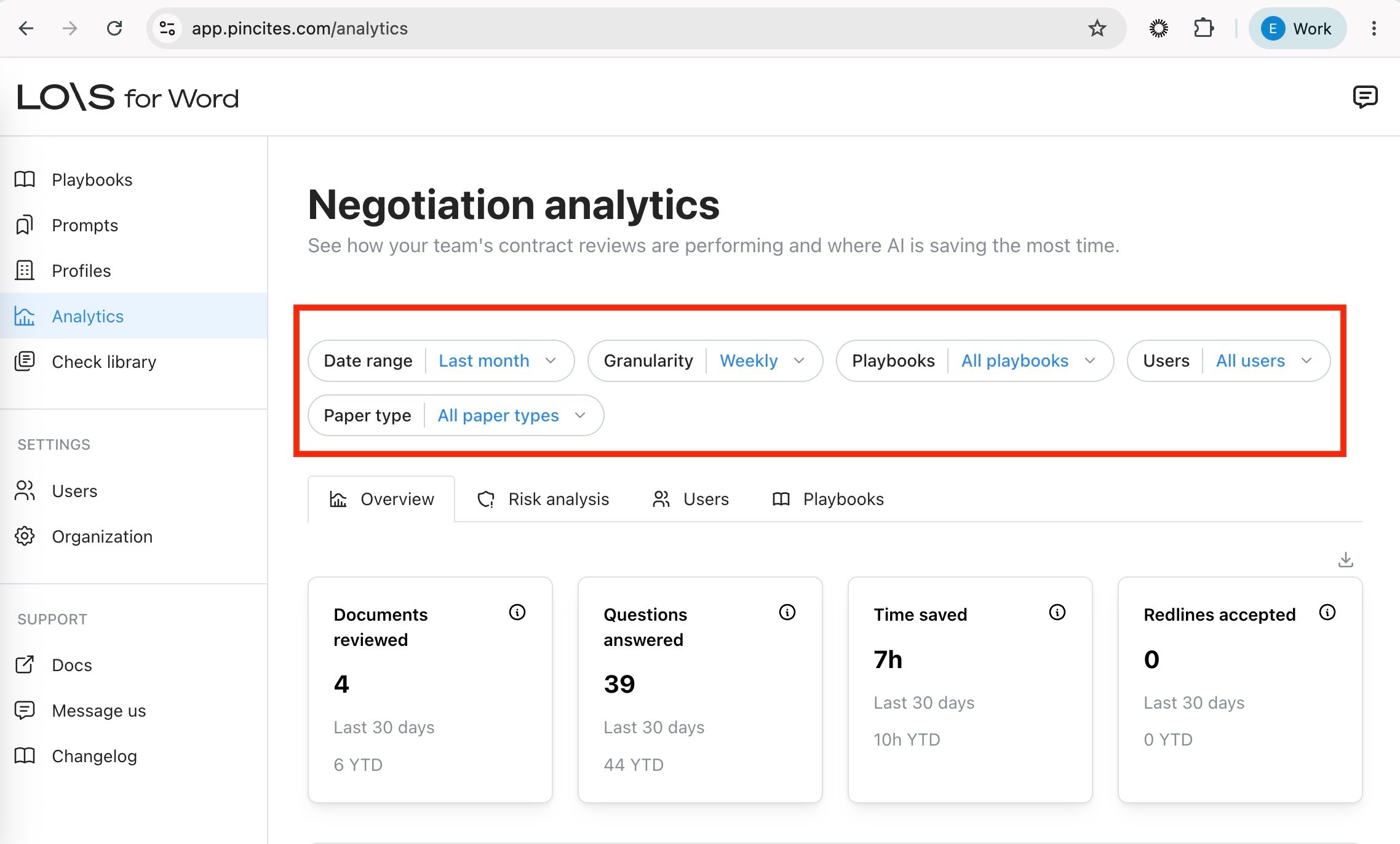
Date range
Use the Date range chip to scope metrics to a time window. Presets include last week, last month, last quarter, and last year. Select Custom range to pick an arbitrary start and end date. The selected window is displayed asMM/DD/YYYY – MM/DD/YYYY and applies to every chart on the page.
Granularity
Use the Granularity chip to choose how metrics are bucketed over time:- Daily
- Weekly (default)
- Monthly
- Quarterly
Other filters
- Playbooks — narrow metrics to one or more playbooks.
- Users — narrow metrics to specific team members.
- Paper type — first party paper, third party paper, or both.
Use dashboard insights
Use the dashboard data to understand adoption, guide training, and demonstrate value across your organization:- Use the user metrics table to find team members who may need training.
- Identify power users who can share best practices.
- Filter by playbook to compare adoption across contract types.
- Track time saved to demonstrate value to stakeholders.